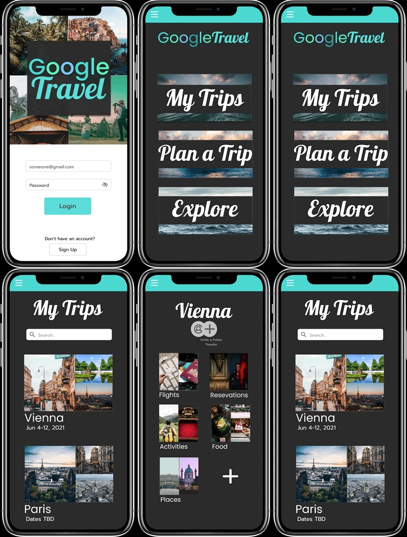
During my 3 month course with Udacity’s UX Nanodegree, I was tasked with taking a design idea through the UX stages of research, design strategy, user testing, and user interface design. The result of this project is the Google Travel App. You can see the prototype for the final project here.
Google Travel is an app with a hypothetical Google collaboration that helps travelers organize their trip itineraries. It makes traveling easier by putting all travel needs in one place - from storing plane tickets and dinner reservations to allowing users to explore different things to do at their destination. My role was to research, design, and test all UIs related to the project. Keep scrolling to follow the app from ideation to engineer handoff.
Step 1: Identifying a Challenge and Selecting a Design Problem
A 2019 article from the Guardian stated that global tourism has hit record highs in recent years. With 1.4 billion people traveling internationally every year, I wondered if their needs when planning trips were being met.
Through my early research and user interviews, I found that there was no lack of resources when it came to planning trips, but travelers didn’t seem to have an easy way to organize their vacation itineraries.
I set out to design an app that is made for international travelers who long for a more orderly and inspired approach when it comes to planning their trips.

Step 2: Discovery, Research, Analysis
I began my discovery process by interviewing a small sample size of international travelers in order to discover their trip planning habits and pain points they come across when organizing their trip itineraries. During our conversation, I narrowed my focus to each user’s most recent international trip.
Using Miro, I synthesized key insights and revelations and had 2 major takeaways:
1. 3 out of 5 travelers wished they had planned better. The travelers I spoke to often ran into problems when they didn’t plan ahead. More than one realized too late that they picked the wrong time of year to travel to their destination. Others hit road bumps when trying to navigate foreign transportation services.
2. Every single traveler I interviewed used Google in some capacity when planning their trip. One traveler used Google apps for everything from stalking airline deals in Google Flights to organizing their itinerary in Google Docs and Google Calendar. Another traveler utilized Google just for researching landmarks while a third traveler used Google maps to search for nearby landmarks and to check restaurant reviews. All travelers seemed united in seeing Google as a helpful resource.
According to one traveler, “Maybe it would have been better to plan ahead more. We should have had a more organized approach.”
So what did these insights mean? First, I felt that my theory that travelers did not have a clear way to organize their trips was validated. All of the travelers traveled internationally often, ranging from once every year to once every other year (Pre-covid) and they either already liked to plan out their trip or wished they could plan better.
Second, Google has already created several tools that are useful to travelers when planning their trips. I decided since all of our users were already using Google to help plan their trip, it would theoretically make sense to partner with them to create an all-in-one travel app.


Step 3: Design Concepts and Wireframing
For the next step in my project, I needed to select one part of the user journey to focus on and ideate further. Since I had decided that this app would be integrated with Google, it seemed to be a given that most of the user journeys would look the same as they already do within other Google apps.
For me, the most interesting part of this app would be figuring out how travelers would organize and sort through all the information gathered for their trips. When thinking of the best approach to this task, I immediately thought of Pinterest boards. I thought it would be a neat idea to let each trip or city be its own Board. Within each board, travelers could separate out categories of flights they’re interested in tracking or have already booked, hotel reservations, restaurants of interest, and more.
Since this concept seemed like it would be of high value to users and easy to execute, I decided to iterate on it further and sketched out some wireframes.

Step 4: Building a Low Fidelity Prototype
With wireframes in hand, I took to Figma to create a low fidelity prototype of the app experience. By starting out with the low fidelity prototype, I was able to focus solely on functionality with my first round of usability testing.
During these tests, I discovered that my sample size of users had an easy time navigating the app, until they came to the screen with the different trips/cities. Most understood the process of clicking on the city and then seeing the other boards but did not know what the top plus button on the individual trip pages meant. I decided to add text below the button to make its purpose more clear that users were being given the option to add a fellow traveler to their trip.
Since this was really the only problem users seemed to have, I moved on to the next step.

Step 5: Validation, Usability, Feedback
After a quick round of usability testing, I took my initial concept and fleshed it out into a high fidelity clickable prototype. I then ran this prototype through a series of tests to see how different features were perceived by our users.
First: I utilized WebAim to make sure the color combos I used in my app passed a color contrast test. They failed initial tests so I reworked my color scheme to make the text within my app more readable.
Second: I conducted a usability study within Lookback to gain some insight into how users would interact with the travel app. Through this process, I learned that users were having issues with some of the links in the app because they did not realize they were clickable. To remedy this, I added a color change when the links were hovered over in order to give better indication that they were interactive buttons.

Step 6: Engineer Handoff and Stakeholder Presentation
For my final step, I created a style guide that listed all the colors, fonts, and icons that were utilized and prepared the app for engineer handoff using Zeplin. I then built a Keynote presentation detailing my research, key findings, and design recommendations to be presented to key stakeholders. This is where my project with Udacity ended.

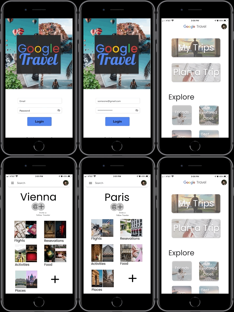
After submitting my final project, I went back to my project to look for areas of my app that could be improved upon. I made the following changes:
1. I updated the color scheme and fonts to better mimic Google. I wanted the app to look and feel more realistic to how it would look if it was genuinely developed by Google.
2. I wasn’t happy with the look of the main view. I realized the solution I came up with during my project for making the buttons look more clickable (adding a color change when the mouse hovered over them) would not be a workable solution within a mobile application, so I went back to the drawing board. I added rounded corners and drop shadows to make the buttons appear more clickable and added more options near the bottom of the page in order to give the app a more sophisticated, modern look.
