Romp & Roam Redesign
Project Scope
Role
UX Researcher, UX/UI Designer
PROBLEM
With 11 main menu categories, Romp & Roam’s website was overly complicated and confusing for users to navigate.
SOLUTION
Compiling findings from user research, we condensed the main categories down to 3, making the site easier for customers to use
WHAT I DID
I identified the best user research methodologies for our redesign project and utilized them to build a better user experience.
WHAT I LEARNED
Although I started this project focused solely on the user experience, my talks with the business owner exposed pain points in the business itself. Our solution to the user experience issue also resulted in setting up the owner of Romp & Roam with a more sustainable business model.
About Romp & Roam
Romp & Roam is a business that specializes in custom made clothing for children aged newborn to 8 years.
Brittany McCrea (the sole owner and proprietor) sources fabrics, takes orders, sews the clothes, and runs the Shopify website and Facebook group all by herself.
It Started with a Facebook Post
In April 2021, Brittany posted a step-by-step guide on how to use her website to her business’s Facebook page.
This was a signal to me that the information architecture on the site could use improvement. I approached her to see if she’d be open to us teaming up together to find a better way forward for her store and she gladly accepted.
Research
From the Facebook post, we knew we wanted to focus on information architecture and user flow, so I started my research with an audit of the existing flow. It seemed a little alarming that the main menu had 11 different product categories to choose from.
Competitive Analysis
From here, we looked at 3 different competitors to see how the organization of their online store’s compared to Romp & Roam. This confirmed our suspicions that the shop owner had set up a shop categorization that was overly-complicated.
Romp & Roam had significantly more primary categories than competitors.
User Surveys
Next, we sent out a user survey to her core customers which we used to try to get a better idea of their shopping habits and needs. We received 41 responses.
Primary Findings
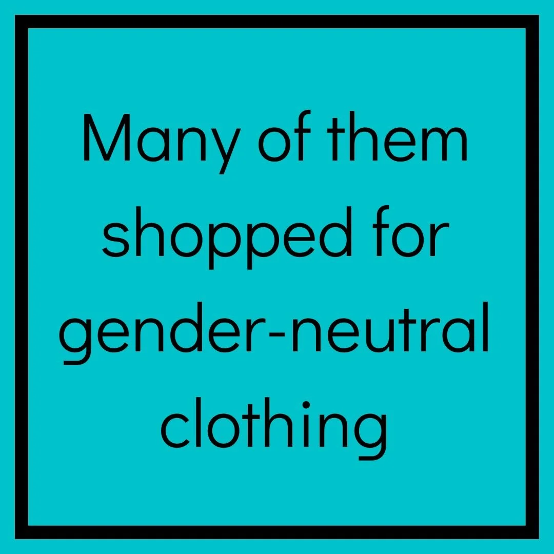
After looking through the responses for the survey, we felt confident drawing the following conclusions about our Romp & Roam shoppers:
Ideation of Solution and Feature Prioritization
After receiving the results of the survey and combining them with what we found from competitive research, we plotted our ideas and user suggestions on the chart below in order to figure out where we should focus our design efforts.
Final talks with the shop owner
Brittany and I had several talks over the course of the project. There were two main issues that kept coming up:
Customers wanted to see real pictures of the clothes they were purchasing, not just mockups. (This was next to impossible to provide, seeing as how every item was made to order)
The shop owner wanted to give her customers every option available for customization - this led to long production timelines and a timely process of updating the website every time she added a new pattern collection.
We realized we could solve both problems by using her website exclusively for ready to ship items.
She could then use her Facebook group to still offer customized clothing, with the caveat that orders must be placed the first two weeks of every month so she could order all her materials at the same time.
redesign rollout
Our final step was to launch the website with the new information architecture. With the simplified, streamlined structure shown below, products became easier to shop for and the site became easier to update.
It will take time for the shop owner to build up her inventory, but I would love to eventually reach back out to her users to see how they like the new design and test the level of ease they have with navigating the redesigned site.


